

Understanding Workbooks, Pages, Elements, and Folders
Understanding the main components of Advanced Dashboards and Reports (ADR) helps you organize, access, and analyze your data more effectively.
In this article, you’ll learn:
- The main components of Advanced Dashboards and Reports
- How dashboards and reports are organized
- How elements, pages, workbooks, and folders work together
Elements, Pages and Workbooks
Advanced Dashboards and Reports are organized into several components that work together to help you visualize and analyze your data.
The main components are:
- Elements
- Pages
- Workbooks
- Folders
These exist in a hierarchy, where workbooks contain pages and pages contain elements. Each component helps you organize your data so you can view, customize, and manage dashboards and reports more effectively.
Elements
Elements are objects that you add to workbooks. They are the basic building blocks in our Advanced Dashboards and Reports.
Element types include
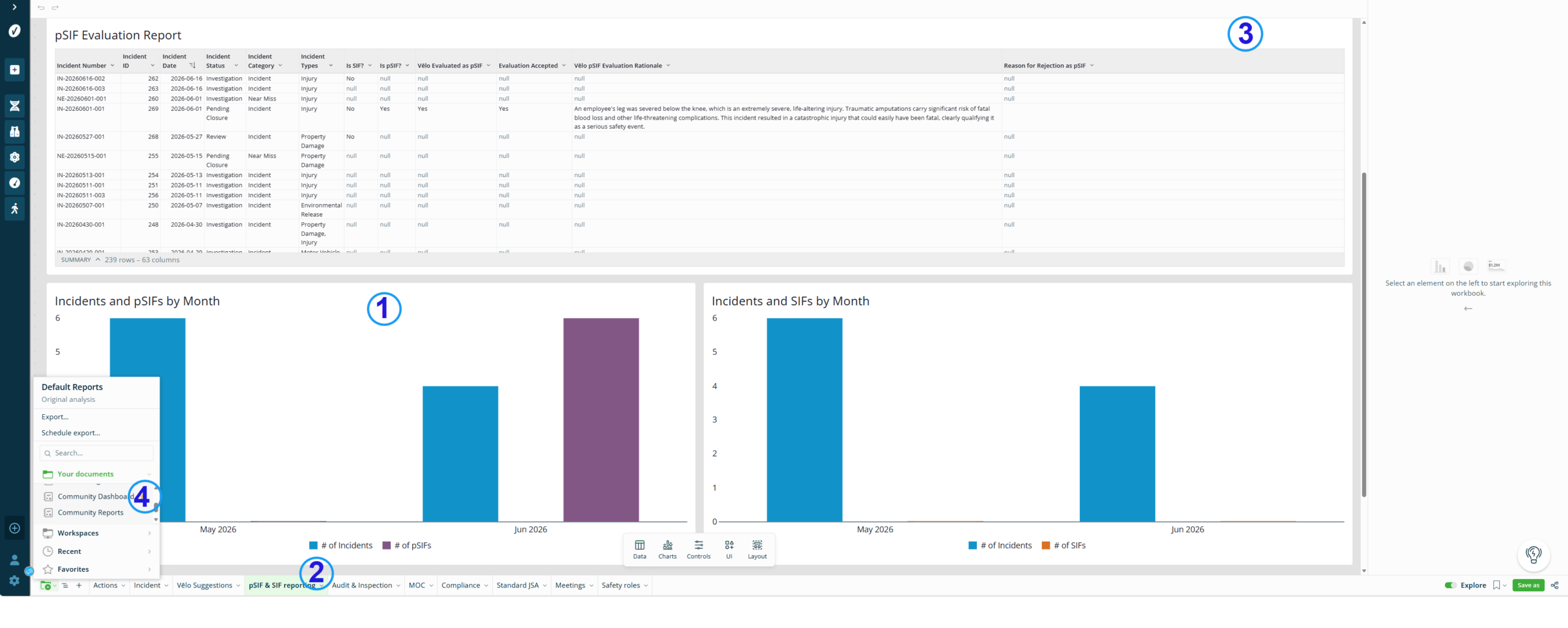
- Data elements: Charts and Tables
- UI elements: Text, images, buttons, embeds, and dividers
- Control elements: Filters and controls
- Layout elements: Containers and modals
Your Accelerate account includes a default set of dashboards and reports with key-metrics already available. These defaults help you begin reviewing your data as soon as you access Advanced Dashboards and Reports.
For more information, see Default Dashboards and Reports.
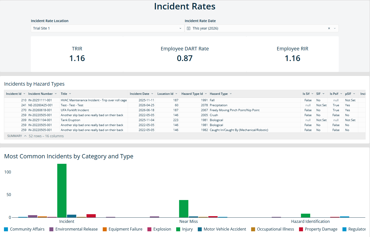
Data Elements are the core elements used to display your Accelerate data. Each element includes its own filtering options and functionality, allowing you to explore specific data points and trends.
Data Elements: Charts and Tables
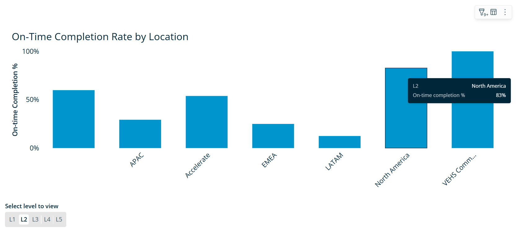
- Charts help you turn complex data into easy-to-read visuals, such as bar graphs, line charts, maps or diagrams. Dashboards in Accelerate use different chart types to help you quickly understand and interact with your data.
For example, a chart may show incident trends by month or compare incident types across locations.
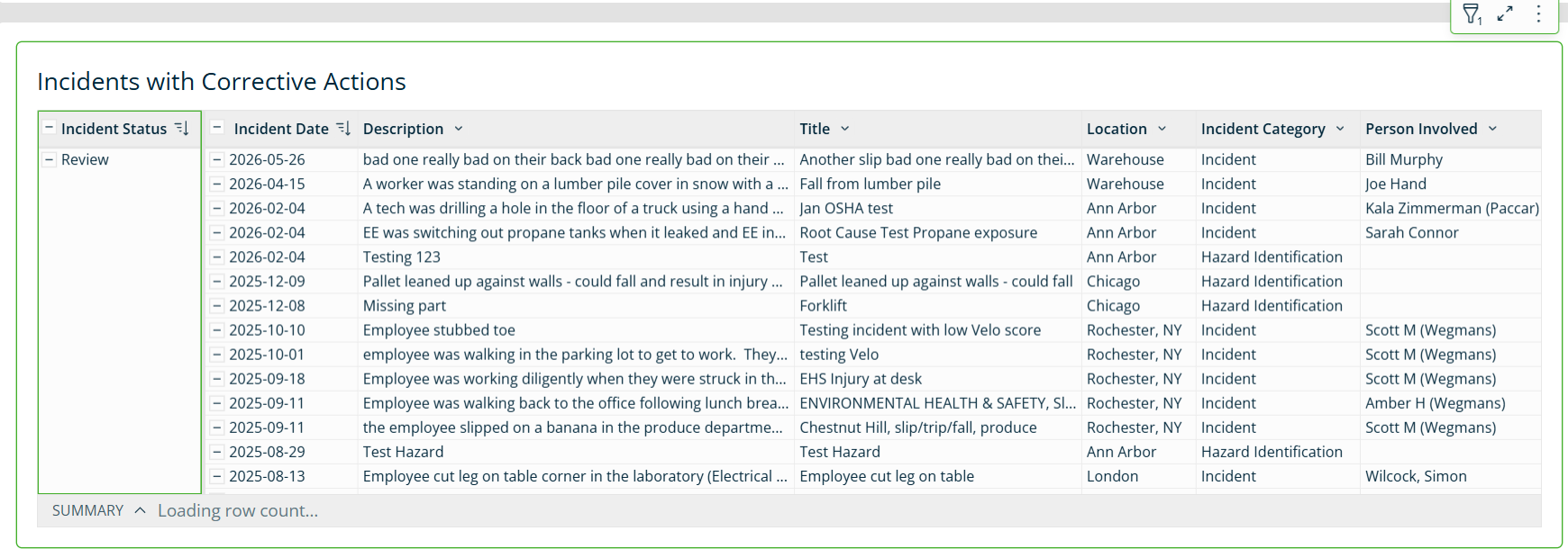
- Tables organize data into rows and columns. They provide a detailed view of the underlying data and help you review specific records or values.
For example, a table may list corrective actions organized by status, showing incident records and specific parameters.
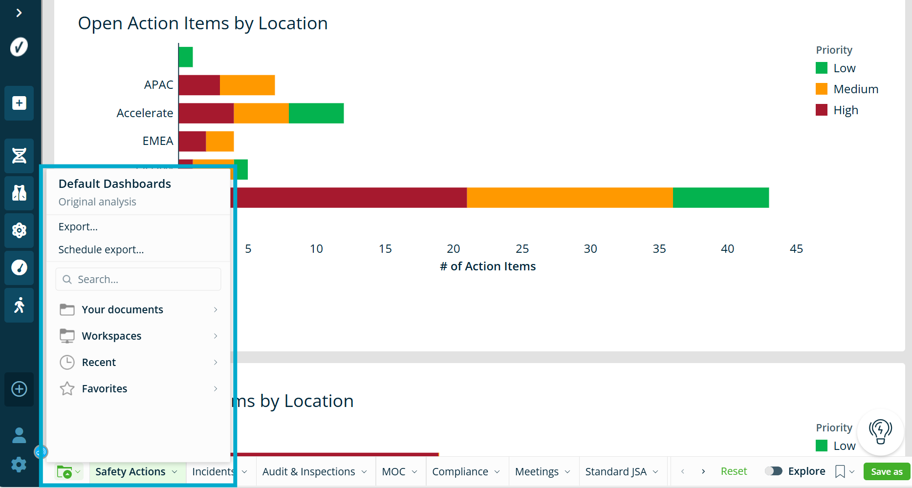
Workspaces
Workspaces contain preloaded dashboards and reports provided by VelocityEHS. These resources are designed to help you explore data quickly and efficiently without starting from scratch.
In Workspaces, you’ll find organized folders with ready-made content, including:
- VEHS Default Dashboards
- VEHS Default Reports, including reports related to Action Management
- Capability-Specific Content, based on the features enabled in your platform, for example, Audit and Inspection, Compliance Management, Incident Management, Industrial Ergonomics, and more.
Each workspace includes tables and visualizations specific to that area, helping you review important data and take action with confidence.
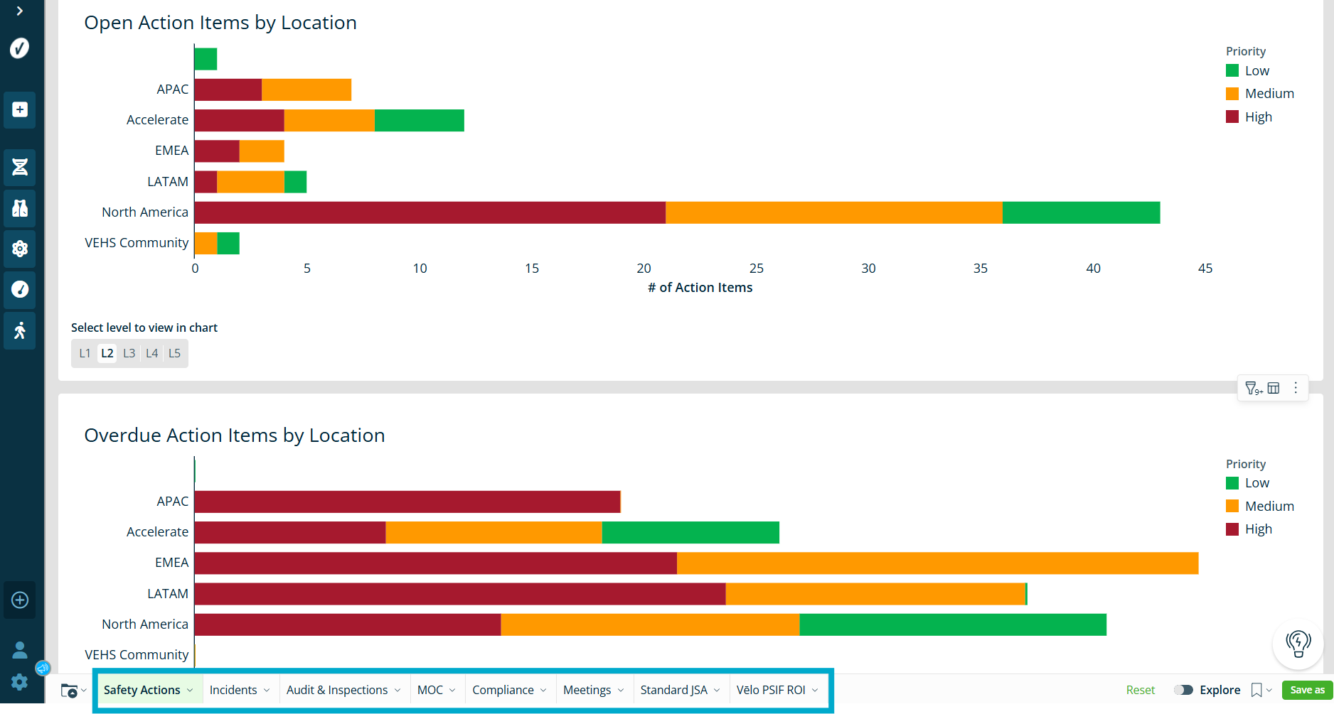
Charts
Charts help you turn complex data into easy-to-read visuals, making it faster to spot trends, track progress, and identify areas that need attention. Dashboards in Accelerate use a variety of chart types to help you quickly understand and interact with your data.
In addition to charts, some dashboards include tables. Tables organize data into rows and columns, giving you a detailed view of the underlying numbers. Charts, on the other hand, are used to visualize how metrics relate to each other and highlight important patterns.
Common Chart Types
Choosing the right chart makes your data easier to read and understand. Each chart type highlights your information in a different way:
- Bar charts show how values vary across different categories or groups. They are great for comparing multiple metrics side-by-side or showing proportions relative to a goal or benchmark.
- Line charts track how one or more values change over time. They are ideal for spotting trends, identifying seasonal patterns, and tracking performance shifts.
- Area charts are similar to line charts but fill the space beneath the lines. They help highlight the magnitude of values over time and make it easier to see cumulative changes or part-to-whole relationships.
- Scatter plots show the relationship between two different metrics. They are helpful for analyzing patterns, understanding data distribution, and identifying outliers that may need closer attention.
Workbooks
A workbook is a customizable space for you to create, edit, and organize your elements. Workbooks help you group related charts and tables into a single space.
Charts are commonly used in Default Dashboard Workbooks, while tables are mostly present in Default Report Workbooks.
Pages
Workbooks contain one or more pages that act as separate views within a workbook. They allow you to organize information by topic, location, process, or business area.
Folders
Folders are where you save, share, and manage your dashboards and reports.
Folder sections may include:
- Documents: Your personal space for drafts and work that is only available to you.
- Workspaces: Pre-created folders organized by access and permissions. Workspaces allow you to share dashboards and reports with your users and administrators.
- Exporting capabilities: Options for sharing dashboards and reports outside of Accelerate, including scheduled exports.
To learn more about Folders in ADR, see Saving, Organizing, and Sharing Dashboards and Reports.
