

Navigating an Advanced Dashboard
Advanced Dashboards in Accelerate are designed to help you quickly view and interact with safety data that’s relevant to your role. This guide walks you through how to move through a dashboard, apply filters, and get the most out of the insights available to you.
Opening a Dashboard
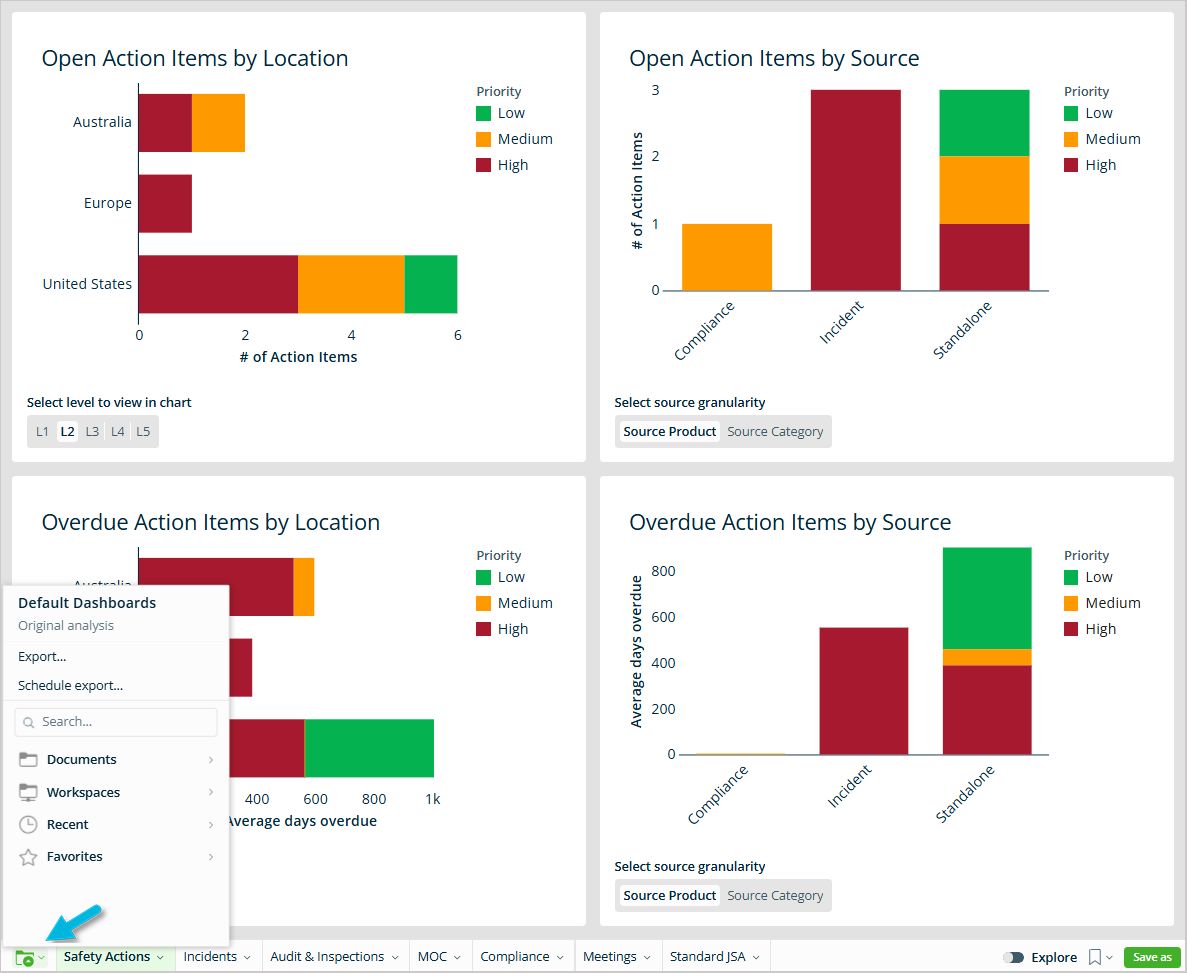
To get started, go to Platform > Advanced Dashboards. The system will open directly into a default dashboard view. To select a different dashboard, use the folder icon in the bottom-left corner of your screen. From there, you can access company-wide dashboards, location-specific views, or any dashboards you’ve saved or favorited.
Pages (Tabs)
Many dashboards include multiple pages, which appear as tabs at the bottom of the screen. Each page gives you a different view or set of metrics — for example, one tab might show incident trends while another shows training completion.
Select any page name to switch between views.
Filters and Controls
Dashboards often include filters at the top or side of the screen to help you focus on specific data.
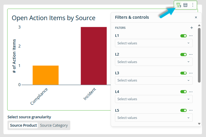
To use filters:
- Locate the filter panel or dropdown.
- Select the values you want to apply (e.g., date range, location, department).
- Wait for the dashboard to auto-refresh with your filtered data.
Charts and Tables
Each dashboard contains charts and sometimes tables to help you visualize your data.
Charts may include bar graphs, line graphs, or other visuals. Tables display detailed rows of data so you can review specific records.
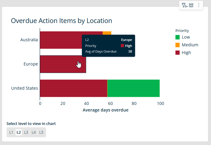
You can hover over chart elements to view tooltips with more information or underlying values.
Exploring Underlying Data
To dive deeper into a data point:
- Right-click (or left-click, depending on your setup) on a specific value.
- Select Show underlying data from the menu.
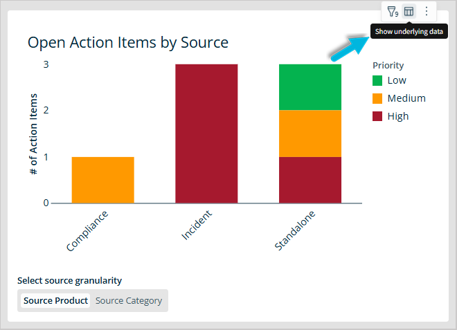
- In the resulting view, you can interact directly with the chart or table to explore more details, adjust filters, or add or remove columns.
Tips
- This function is helpful when you want to understand what’s behind a number, especially if something doesn’t look the way you expect.
- Any “drill-down” into the data will respect your current filters.
Saving a View
If you’ve adjusted filters and want to save your changes:
- Select Save As in the bottom-right corner of the dashboard frame.
- Name your view and choose whether it’s a personal view (just for you) or a shared view (if you have permission).
Your saved view will appear in a dropdown list the next time you open the dashboard.
